Ancillary Tasks
ANCILLARY TASK
06/01/18 - HISTORY AND THEORY OF FILM POSTERS
After reading article after article and watching video after video, I decided that I was going to sum up the history of film posters and even talk about a theory or two, while i'm at it. So here we go!!
Originally, film posters were produced for the exclusive use by the theatres exhibiting the film the poster was created for, and were required to be returned to National Screen Service (NSS) which printed and distributed most of the film posters for the studios between 1940 and 1984. In a way to save money, the NSS recycled posters that were returned back to them, by recirculating them into other theatres, with this film posters could be in circulation for years where they would become worn, where they would be sent back to the NSS to retire.

THEORY
The colour behind the posters.
Why do movie posters look so much alike? by Bambi Turner
In this article I found Bambi discusses how Hollywood produce such a range of films, with the use of the same technique to help capture their potential target audience.
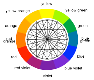
In this article, Turner proposes that a large amount of films created nowadays by Hollywood, look very similar due to them following the same colour scheme, this being orange and blue. The reasoning behind this is that they are complimentary colours. Complimentary colours being the colours that are opposite to each other on the colour wheel, and the reason for the use of blue and orange is that other complimentary colours are already associated with something. For example, red and green being associated with Christmas and blue and pink being associated with babies.
With the film market being saturated with blue and orange colour schemed posters, it's now common to associate these colours with action/adventure film. In 2012, Vijay Pandurangan proved that movie posters had become darker in their colours e.g. blue and orange. Due large growth in demand for thriller and action films, which typically use darker and more masculine shades and tones.
For example:
The poses behind the poster.
Turner goes further on to explain about the poses presented in the movie posters and that how a majority of Hollywood films use the same poses depending on the genre of the film. For example, in rom com posters typically the two main protagonists are displayed back to back with a white background (Pretty Woman). The reason for movies using similar poses is due to the success of past films that have used similar poses.
07/01/18 - POSTERS AND THINGS
Yes finally I have started the ancillary task. For this we have to make a film poster for our film, where we have to include original photos. Furthermore, we also have to create a film review in a magazine style.

After reading article after article and watching video after video, I decided that I was going to sum up the history of film posters and even talk about a theory or two, while i'm at it. So here we go!!
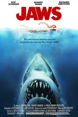
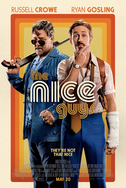
A film poster is a poster used to promote and advertise a film. They are essential to help market a movie, typically a studio will create variations of the poster which is displayed to the public. Now a days posters are made through the use of editing software and photos but prior to the 1990s, illustrations were more common in displaying a poster.
Here are some examples:
1971: 2016:


THEORY
The colour behind the posters.
Why do movie posters look so much alike? by Bambi Turner
In this article I found Bambi discusses how Hollywood produce such a range of films, with the use of the same technique to help capture their potential target audience.
In this article, Turner proposes that a large amount of films created nowadays by Hollywood, look very similar due to them following the same colour scheme, this being orange and blue. The reasoning behind this is that they are complimentary colours. Complimentary colours being the colours that are opposite to each other on the colour wheel, and the reason for the use of blue and orange is that other complimentary colours are already associated with something. For example, red and green being associated with Christmas and blue and pink being associated with babies.

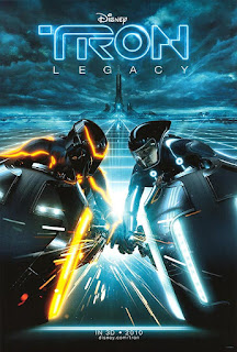
With the film market being saturated with blue and orange colour schemed posters, it's now common to associate these colours with action/adventure film. In 2012, Vijay Pandurangan proved that movie posters had become darker in their colours e.g. blue and orange. Due large growth in demand for thriller and action films, which typically use darker and more masculine shades and tones.
For example:
2010 2017

The poses behind the poster.
Turner goes further on to explain about the poses presented in the movie posters and that how a majority of Hollywood films use the same poses depending on the genre of the film. For example, in rom com posters typically the two main protagonists are displayed back to back with a white background (Pretty Woman). The reason for movies using similar poses is due to the success of past films that have used similar poses.
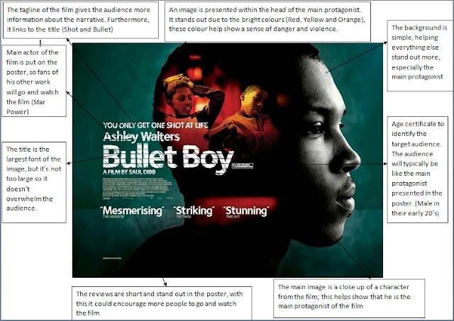
So today I decided that I was going to review and annotate a few short film posters, in this case I looked at Drawback, Bullet Boy and A New Beginning. Because you cant just go straight into the deep end and expect to do the best.
POSTER 1
POSTER 2
POSTER 3
So when annotating these short film posters, I noticed a few things that they all have in common. For example, they all have one dominant image or character presented in the centre of the poster, this allows the audience to understand either who the main protagonist is or what it is typically based upon. Furthermore, they all have very simple and dark backgrounds to help show off the main image or the title, enabling the audience to understand the poster more easily. Lastly, the tagline plays a large role in hinting to the story without giving anything away (it tells more about the story than the actual image).
15/01/18 - RESEARCH INTO TAGLINES
Today I decided that I was going to look at tagline and how important they are for film posters, so the best way to start is by looking up the definition!
From annotating short film posters, I noticed that the tagline plays a major role in attracting an audience and also hinting towards the story line without giving anything away. With this I decided that I was going to do some research into taglines.
TAGLINE 1
TAGLINE 2
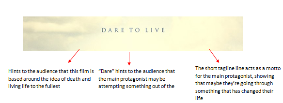
TAGLINE 3
When annotating these taglines, I noticed that all the taglines either heavily link to the title or show subtle hints towards the story line, without giving anything away. Furthermore, they're typically very short (2-4 words long) if not they're typically statements that relate to the main protagonist presented on the movie poster. Typically the tagline is smaller than the title, however, it can be used the other way round to show the significance of the tagline.
From this annotating I decided that I was going to think of a few for my film poster, these were the ones I came up with:
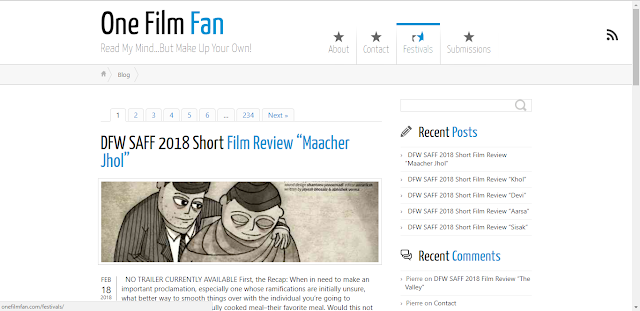
Due to my film being an independent film, Ill need to use ratings and quotations from independent reviewers, with this I decided to do some research into independent film reviewers and discover who would review my film.
The two websites I found were "OneFilmFan" & "IndyRed"
15/01/18 - RESEARCH INTO TAGLINES
Today I decided that I was going to look at tagline and how important they are for film posters, so the best way to start is by looking up the definition!
From annotating short film posters, I noticed that the tagline plays a major role in attracting an audience and also hinting towards the story line without giving anything away. With this I decided that I was going to do some research into taglines.
TAGLINE 1
TAGLINE 2

TAGLINE 3
When annotating these taglines, I noticed that all the taglines either heavily link to the title or show subtle hints towards the story line, without giving anything away. Furthermore, they're typically very short (2-4 words long) if not they're typically statements that relate to the main protagonist presented on the movie poster. Typically the tagline is smaller than the title, however, it can be used the other way round to show the significance of the tagline.
From this annotating I decided that I was going to think of a few for my film poster, these were the ones I came up with:
If you can't read my terrible handwriting they are:
Love lies for the right reasons.
Till death do us part.
A marriage like no other.
In memories, love lies forever.
After creating these 4 brilliant taglines I decided in order to get the best results, I would show 20 participants (10 female and 10 male between the ages of 16 to 21) our film and ask them which tagline would suit the film the best.
Here are the results:
Love lies for the right reasons - 6
Till death do us part - 4
A marriage like no other - 2
In memories, love lies forever - 8
From my results it is clear that my target audience believe "In memories, love lies forever" is the best tagline for our film, with "Love lies for the right reasons" coming in 2nd (only behind by 2). Furthermore, from my own and opinion and my target audience's opinion, the tagline ill be choosing to use for my film poster is "In memories, love lies forever"
18/01/18 - INDEPENDENT FILM RATINGS
When researching both independent and mainstream films, I have noticed that they all have star ratings or quotations from reviewers stating what they think about the film. This is an essential part to film posters as good reviews and high ratings will attract more people to watch the film.#
As shown from these two independent film posters displayed below they different types of reviews, the one on the left shows quotations from reviewers, whereas the one on the right displayed star ratings with smaller (typically one word) quotations.
When comparing the reviewers for both an independent and mainstream film, we can see a clear difference in who is reviewing which film. For example, the independent poster displayed below is reviewed by independent websites or companies that specialise in reviewing niche/independent films, where as the mainstream poster displayed below is reviewed by global/conglomerate companies such as newspapers (Empire, The Guardian, etc..).
Independent Mainstream
Due to my film being an independent film, Ill need to use ratings and quotations from independent reviewers, with this I decided to do some research into independent film reviewers and discover who would review my film.
The two websites I found were "OneFilmFan" & "IndyRed"

22/01/18 - THEY DON'T CALL ME LEONARDO FOR NOTHING (DRAFTS)
Right so today, I thought why not put my art skills to the test and create some drafts for some ideas I've got for the post, as you can see below I'm not a good artist but you know A* for effort, am I right?
IDEA 1
The first poster displays the two main characters at the bottom (Gary and Lucy), with the observers faded into the background. The reason behind this poster is that I want to show the audience who the main characters to allow them to know the characters, furthermore the idea with having the observers faded in the background allows the audience to understand that there is a known problem within the story. To continue, the colours will be typically dark to help show off the idea of fear and isolation, which emotions are displayed within the main protagonist (Gary) by the end of the film.
IDEA 2
The second poster displays half of the two main protagonists, by having the two main characters displayed on the poster it allows the audience to understand who they are, allowing them to feel comfortable around the characters, furthermore by only displaying half of the characters it creates the idea that they are both hiding something from their past. To continue, the colours will be dark with the two characters being blended into it, creating the feeling of isolation and mystery.
IDEA 3
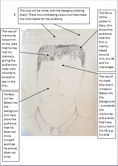
The third poster displays a head shot of the main protagonist, with this memories of the main protagonist are displayed in his head (brain), this allows the audience to understand that the film is based around the idea of memories. Furthermore, by having the poster mainly showing Gary it shows to the audience that he is the main focus of the film and that it is heavily based around him. To continue, by having the black background it allows the memories to be faded into the background, creating a feeling that they don't actually exist.
IDEA 4
The fourth poster displays a head shot of both Gary and Lucy (half and half), this displays to the audience that these two characters are the main focus and that they both play equal roles within the film. To continue, the idea of only showing half their faces it shows that they both have a hidden side that either character doesn't know about. Furthermore, by having a dark background both characters blend into the background creating a sense of mystery.
24/01/18 - GETTING FEEDBACK ABOUT MY ART
24/01/18 - GETTING FEEDBACK ABOUT MY ART
After creating my 4 masterpieces I decided that I was going to get some feedback from my target audience. In this case, I will be asking 30 (15 male and 15 females between the age of 15 and 25) people which poster they believe is the best design.
GRAPH 1
GRAPH 2
GRAPH 3
When collecting my results I decided to know what demographic preferred which poster, as this allows me to know who exactly my target audience is. From my results you can clearly see that Idea 3 was the favourite among my target audience, when looking at the results in more detail when can see that.
GRAPH 1: This graph shows that overall Idea 3 was the favourite among the 4 ideas by a large majority.
GRAPH 2: For idea 1 men preferred the poster more than women but only by a small percentage, whereas idea 2 is heavily preferred by women compared to men. Furthermore, for idea 3 more men prefer the poster design compared to women. Lastly, with Idea 4 more women prefer the poster compared to men.
GRAPH 3: This graph shows that Idea 3 & 4 is preferred by all ages compared to Idea 1 and 2 which are heavily preferred by one age group (Idea 1 - 19-21 & Idea 2 - 22-25).
Overall, Idea 3 is the favourite among my target audience, also being my favourite as well, due to it showing all the characters without giving anything away about who they are and what role they play within the film. Furthermore, I believe it looks the most professional looking poster out of the.
26/01/18 - CREATING THE REAL THING
Well with the preferred poster finally chosen, I decided it was time to actually start the real thing!!
Due to me not owning adobe Photoshop or any Photoshop software for that matter, I searched around on the internet to see if I could find any free software or websites, oh and did the internet deliver!!
I found this gem, called "Pixlr Editor". It's basically adobe Photoshop but free!
RIGHT BEFORE YOU GO ANY FURTHER I HAVE TO TELL YOU SOMETHING ABOUT THE FILM POSTER
Right.. Now I have your attention I need to tell you something.. OK, so when creating the poster that me and my target audience chose, I came to the conclusion that the poster itself was to hard to create on the software I was using due to it not having the essential tools needed to make my poster design look any where near a professional standard, with this I decided that I was going to carry out the same idea but lay it out in a different style, which is much easier to Photoshop.
(Sorry for the inconvenience)
STAGE 1:
I started with a picture of Gary, with this I changed the shadowing and lighting on the picture to make it look more dark and mysterious.
STAGE 2:
After many hours of playing around with this software, I finally added an outline of the observers to the poster. The idea with this is to show the audience that there is a challenge/obstacle within the film without showing who they are.
STAGE 3:
 After playing around with the colouring of Gary and The Observers, I decided to add more light to the shot to give it a sense of realism, furthermore with it being black and white it was hard to make out what the observers outline was, with this I decided to use a shot from the front, instead of from behind making it easier to see the outlines of the observers due to their skin colour and white shirts. Furthermore, I added the title of the film and the rest of the credits to the poster, by using all the same fonts and aligning them proper it made them look more professional.
 STAGE 4:
I felt the poster was missing a key part, this being Lucy Henderson (whats the point of having a filmed based around a couple if you don't show the couple within the poster). With this I added a shot of Lucy and Gary, I decided to use a shot where you can see Lucy more clearly compared to Gary due to Gary already having a large presences on the poster, furthermore I faded the shot making it feel as if it is apart of Gary's memories.
FINAL POSTER
27/01/18 - AUDIENCE FEEDBACK
With my poster completed I decided that I was going to ask some of my target audience to review the poster and say what needs to be improved and what doesn't.
After letting my target audience review my poster these were the main things that needed to be improved:
1. The title needs to be centralised making the poster look more neat
2. Remove "Starring" and move the names to another place of the poster
3. Add the production logo of the company that made the film
4. Fade the observers more, due to them being very clear on the poster
With me getting my feedback back I decided that I was going to make the minor adjustments to the poster, to create my final version of the poster.
FINAL POSTER
So with the poster now done (thank god), it's time to start the review for my film. Before diving into the world of reviews, I need to do some research into reviews both from magazines and the internet.
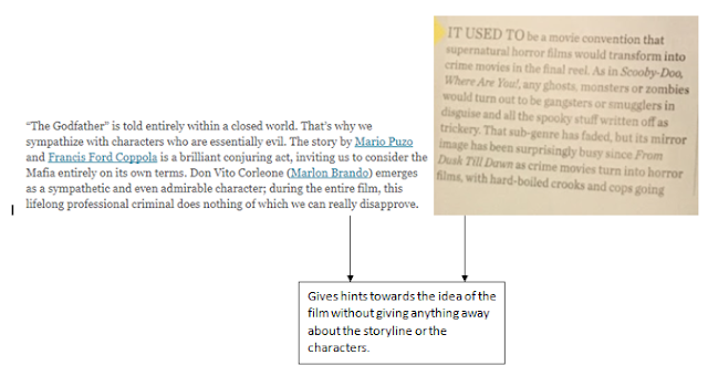
With this I looked at the internet review of The Godfather, and the magazine review of The Vault.
The Godfather The Vault
The Godfather The Vault
The Godfather The Vault
The Differences
As shown from the images above you can see that there is similarities between the two reviews (Magazine and Internet). However, there are difference between them as well, as the internet one goes into a lot more detail above the film itself, analysing more than just the film, where as the magazine is a lot shorter only talking about the film itself (this is because due to the limited amount of space on the page). Furthermore, the internet review uses quotes throughout from the film when talking about certain scenes that stand out or back up the authors point. To continue, the internet review talks a lot about cinematography, the acting and the music.
30/01/18 - RESEARCHING MAGAZINE REVIEWS
As I'm creating a magazine style review, I thought the best thing to do is to research the codes and conventions of a magazine review, looking at the common elements that run throughout the magazine reviews. I decided that I was going to look at two single page reviews and two double spread reviews, to get a broad understanding and idea of different magazine film reviews.
THE ROAD - Single Page Review
THE BANK JOB - Single Page Review
TWILIGHT - Double Spread Review
What I've learned
After looking at the 4 reviews, I've come to decision that portrait reviews (single paged review) are in my opinion are better, this is because they typically get to the point instead of covering and talking about stuff that is not related to the film itself, furthermore I feel like double spread reviews waste space by using overly large pictures on the page, taking up to much room on the page itself. This is why I've decided to create a single paged review where I'll give a more direct review of the film, where I cover the main area (strengths, weaknesses, etc..).
31/01/18 - OVERALL OPINION OF REVIEWS
OK, so after yesterday's productive day, where I looked a 4 different reviews. I decided today that I was going to highlight what makes a good review and what makes a bad review. By doing this it allows me to follow a guideline making sure my review stays with the good side instead of drifting into the bad side of reviews.
03/02/18 - I'M A TRUE ARTIST
Alright with the overall idea of the review set in place, I decided that I was going to plan the layout for my review. Of course the main thing I learned from this is that I still can't draw..
Poster 1
For this idea, I took inspiration from the empire style magazine review. With this I want the main image to be of Lucy and Gary (the one used in my poster), with the review tagline displayed underneath. I feel like this works really well in summing up the film as whole without even getting into any details. Furthermore, I would use two columns each with a box in with the extra details. I like this idea due to its simplicity and effectiveness.
Poster 2
You will have to excuse my terrible drawing, but anyway with this idea I decided that I wanted to use two images both of Lucy and Gary but in two different states of emotion, one being of their wedding and one being of their argument. Furthermore, I will use two columns that are broken up by the title which is displayed in the middle, this helps keep things separate while displaying the title clearly to the reader.
Overall
Personally, I believe that the poster 1 design is better than poster 2, this is because poster 2 feels more cluttered compared to poster 1 due to the positioning of the pictures and the columns, furthermore poster 2 has a lot less space compared to poster 1 making it harder for me to write a review due to it restricting me a lot more with what I want to say.
05/02/18 - LETS BEING THE REAL THING
Now with all the hard work out the way it was time to actually start writing the review, with this I decided to use Microsoft Word due to it being the only software available on my laptop.
So with this I decided it was best to actually write up the review first and the add it to the my review template.
Review 1st

After finishing my review I decided to asked some of my target audience members if they would read and give feedback about what needs to be improved and what doesn't.
These were the improvements that needed to be made:
- Firstly, they believed I didn't write enough about the story itself and that it didn't intrigue them, they believe I need to explain the story more while having my own opinion about the actually story.
- Secondly, they believed that there wasn't enough information about the creators of the film (directors, writers, casts, etc..) they believed by including this it would attract more of an audience due the audience being lured into the process of the film and the thoughts behind the creation.
- Thirdly, they believe that I need to add a verdict (which I do need to add), where I conclude my opinion of the film, they think that this is a good way to wrap up the film.
- Lastly, my spelling and choice of words were not right and that they needed to be changed to make it more enjoyable for the reader
After taking in the feedback given by my target audience I decided that I would dive straight back into the review and do the adjustments given to me by them.
Review Edit/Final
After doing all the suggestions given to me by my target audience, I decided that I would give the same people my review again to see if they believed I had done the right thing and to see if there was any other things that needed to be adjusted.
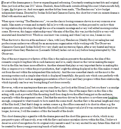
After my target audience looked over my review to see if there was anything else that could be improve, they believed that it was good and that there was nothing that could be improved on, with this I decided to take their word for it and add it to my review template.
09/02/18 - CREATING AND DISPLAYING THE REVIEW
Now with the review written up I decided it was time for me to add it the review itself to the template, which I created a rough draft of earlier within the week.
Oh look another problem, how fun.. So yes a problem has occurred, it seems that I have written to much about the film, making it hard for the whole review to fit onto the page, with this I've decided that my only option is to use either a landscape review or a double spread review.
DRAFT
I decided that I was going to change the review to a landscape style which allowed me to fit the whole review onto the page. However, this design is very basic and needs a lot of improvement. For example, it needs more pictures and more structure to the layout.
I decided instead of using landscape, I was going to use a double page spread instead, which allowed me to have more room, which ultimately allowed me to be more free and creative with the layout of the review, with this I created the review which is displayed below. (THIS IS THE FINAL ONE I PROMISE).
FINAL REVIEW:








Comments
Post a Comment